PROJECT:
IBM QUANTUM VISUAL IDENTITY
2021
IBM QUANTUM VISUAL IDENTITY
2021

ROLE:
Creative Director
TEAM:
Natalie Taylor - ACD
Amanda Talle - Designer
COLLABORATING AGENCIES:
Map Project Office
Universal Design Studio
CLIENT: IBM
Creative Director
TEAM:
Natalie Taylor - ACD
Amanda Talle - Designer
COLLABORATING AGENCIES:
Map Project Office
Universal Design Studio
CLIENT: IBM
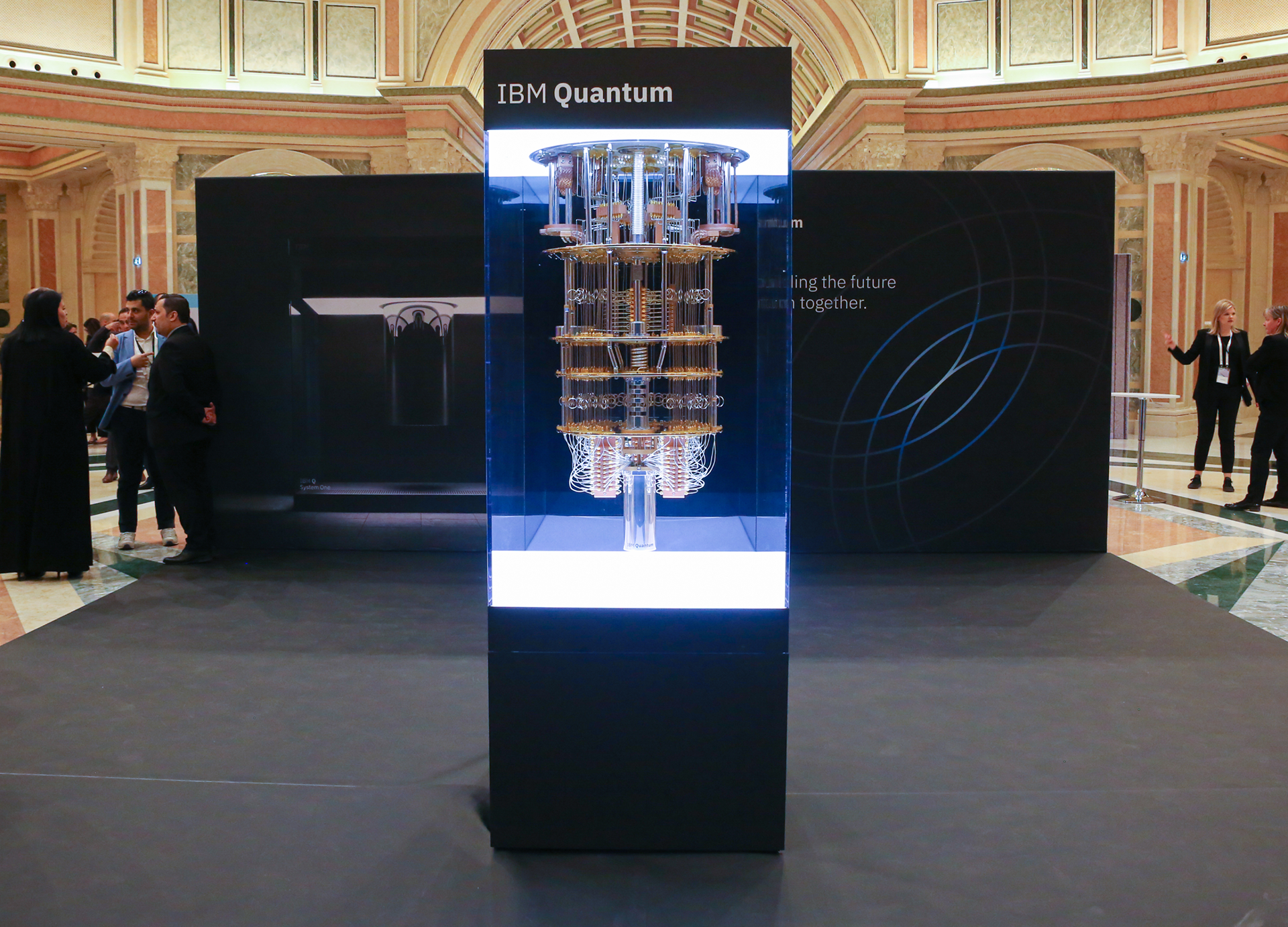
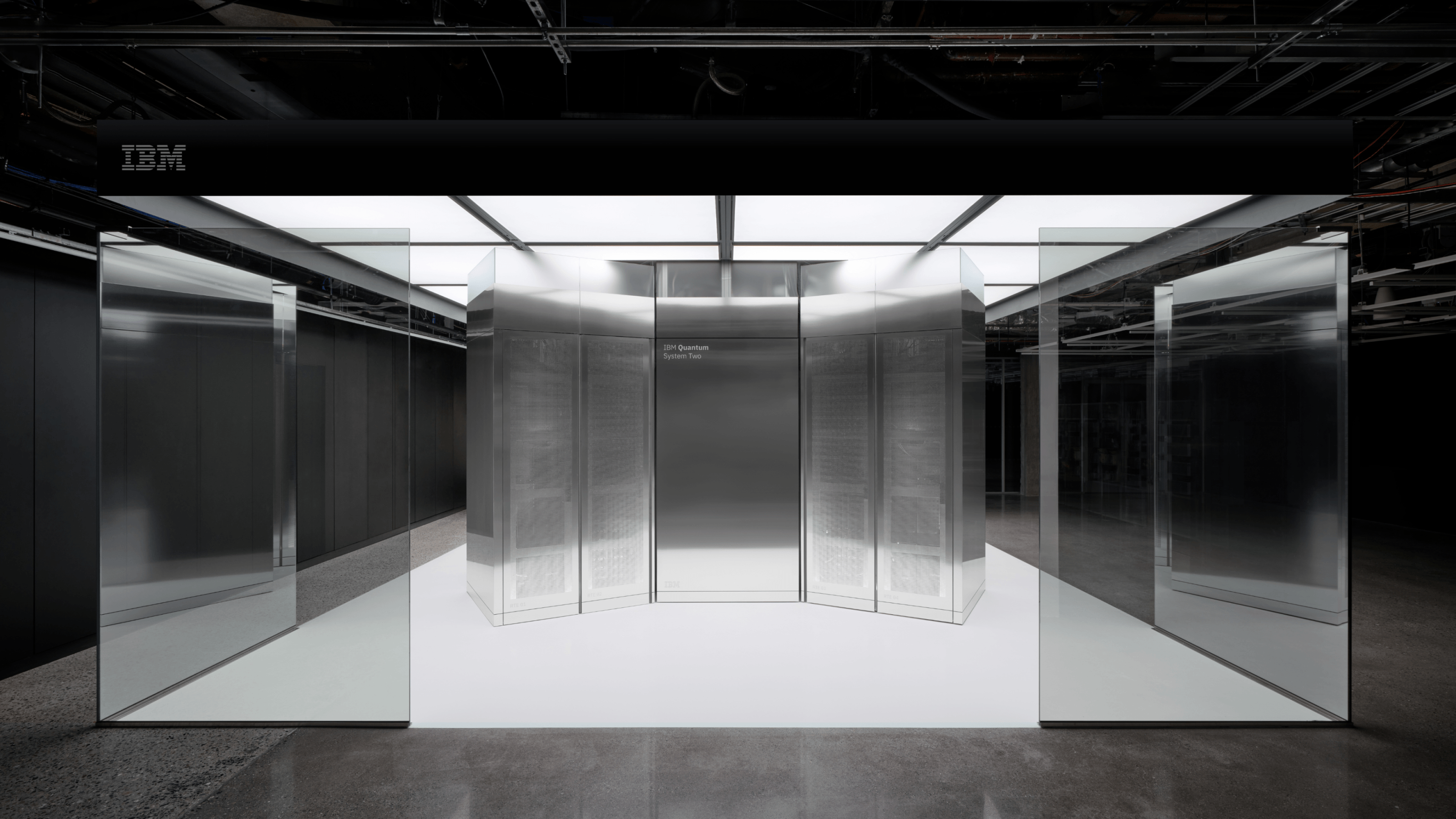
IBM Quantum was in its infancy as a business unit, and its content had become disjointed visually. Without a unifying identity, designers often took design cues from the previous IBM product they had supported. This led to a disjointed visual identity and no direction to guide it as they worked toward creating a business-ready brand.
The brand's goals, objectives, and brand strategy were also in a state of confusion. With a largely technical leadership group, transparency in the process and collaborative workshops were established to mature our stakeholders' understanding of the brand. We developed a brand strategy, including a mission and principles.
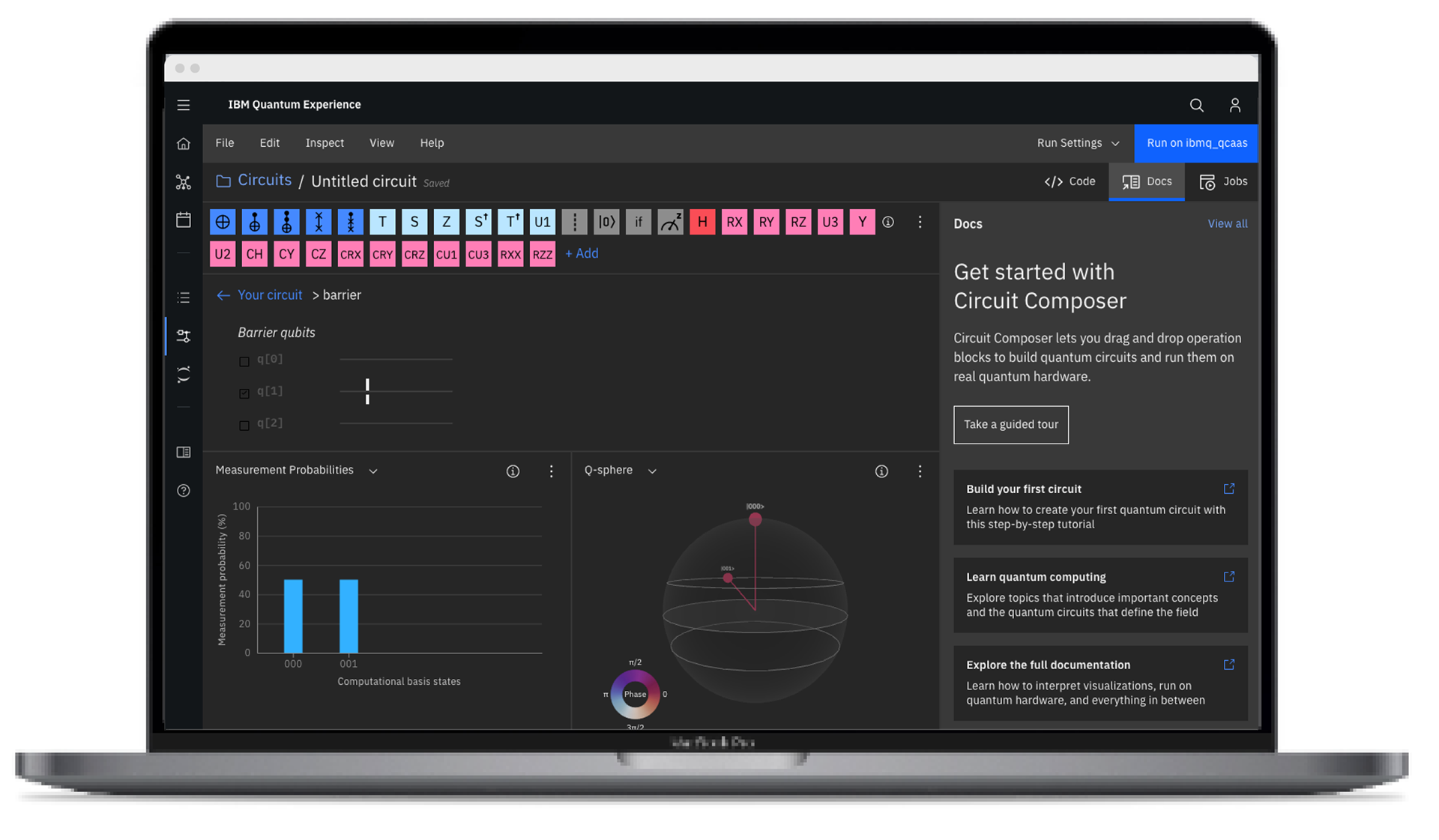
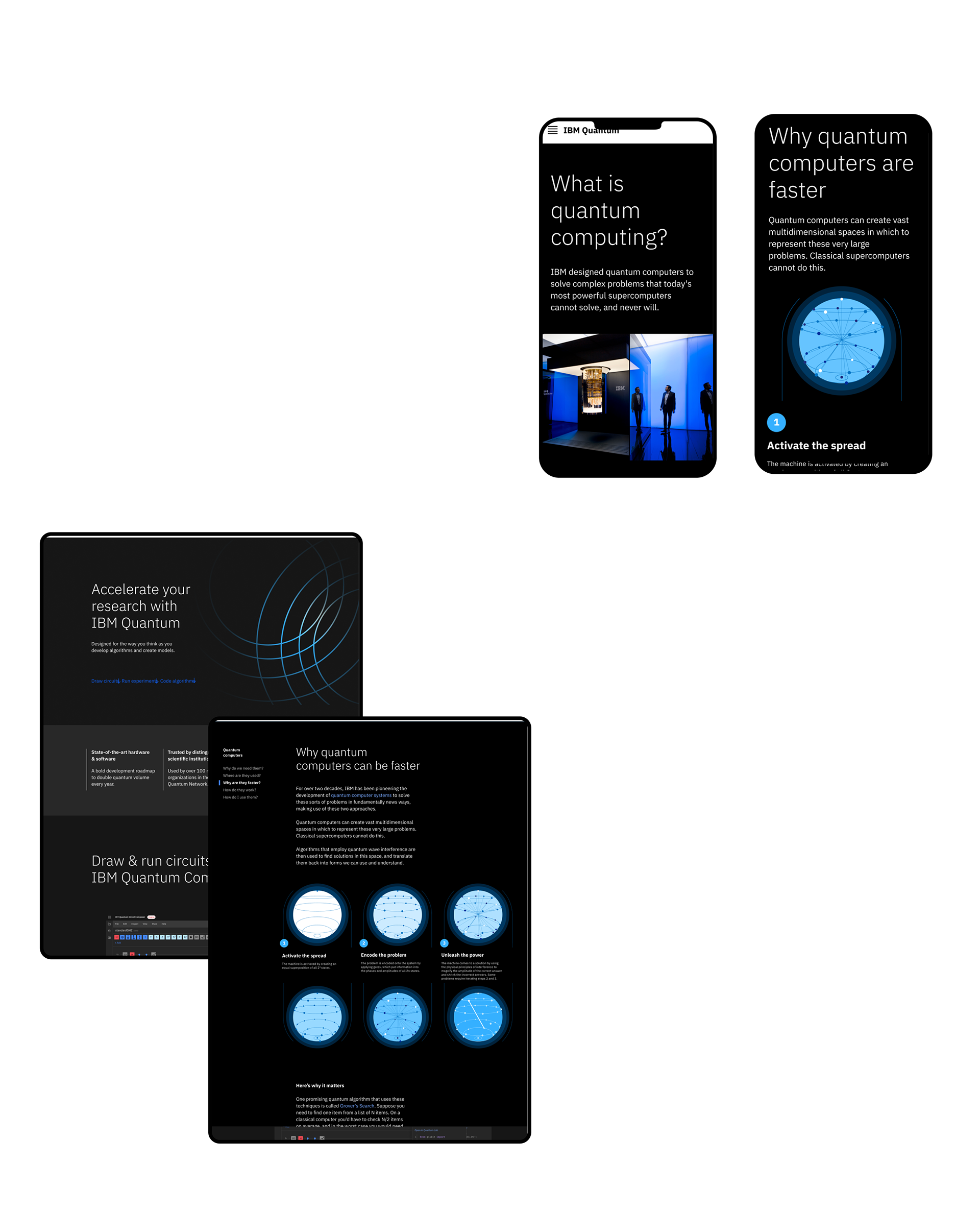
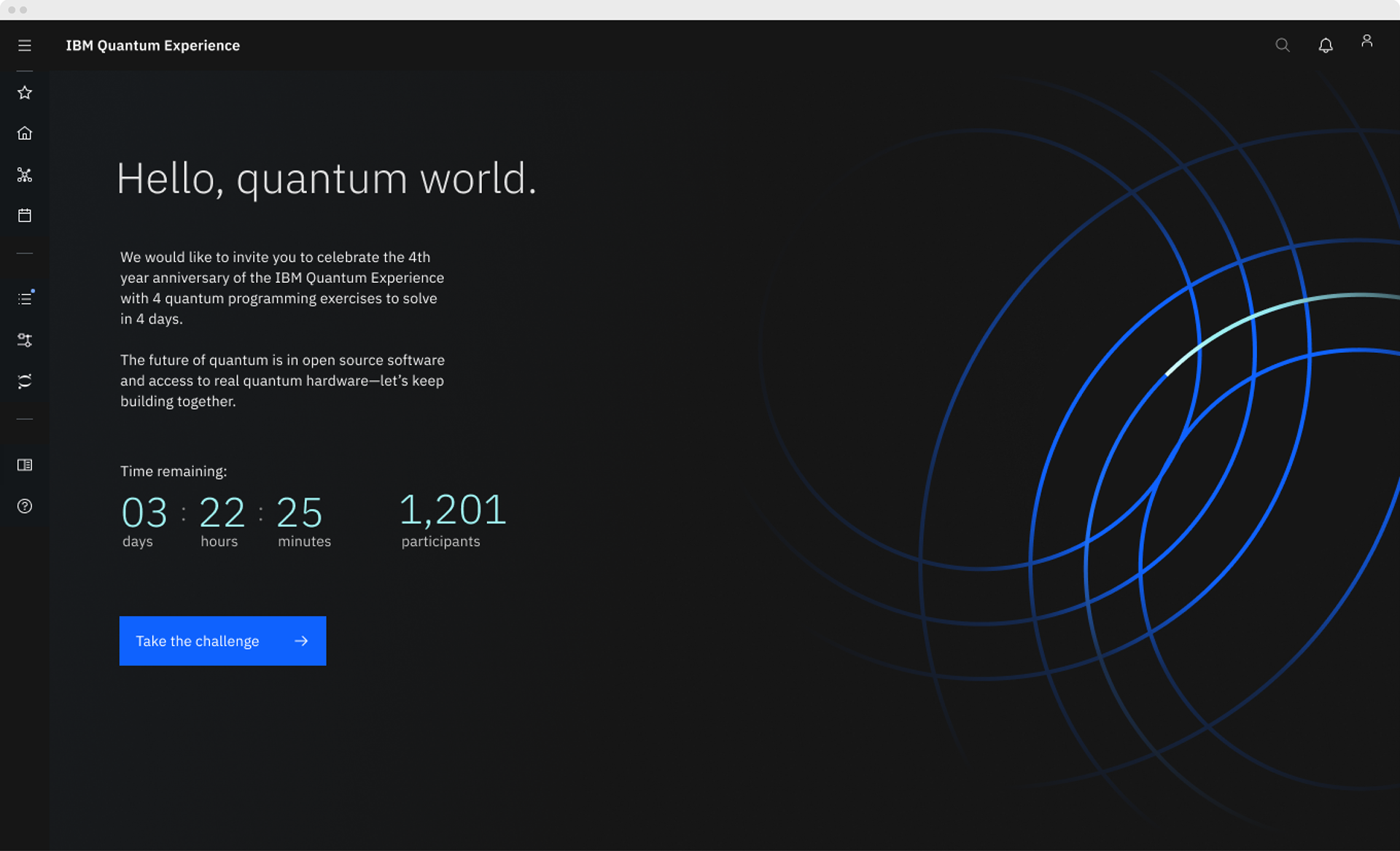
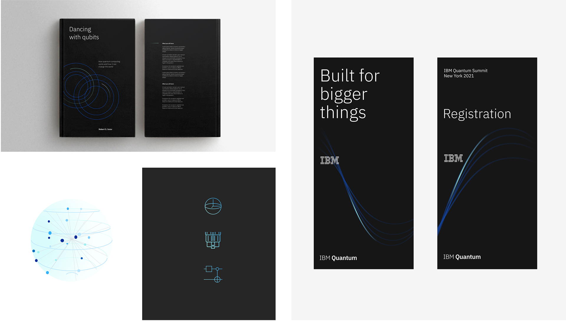
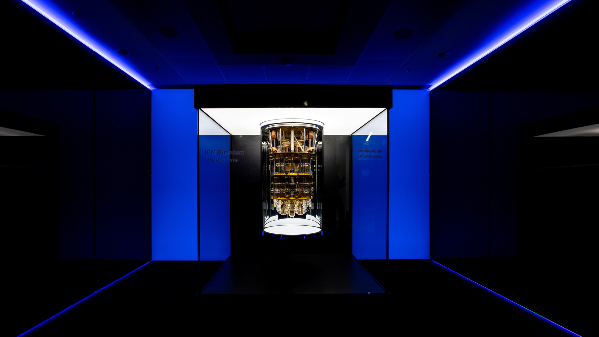
With a brand strategy in place, we turned to the visual identity and its needs. Quantum computing is such a new technology we knew we would need to move this sub-brand closer to the main brand. The adoption of IBM Blue was key to doing this. Next, we needed to bring IBM Quantum System One into the visual language. This device was an outlier in our visual language. Inspired by its design ques we borrowed heavily from its colors, materials, and finishes to bring this design to the heart of our visual language, By mixing the visual elements of System One with IBM Design language yielded a visual language that felt both IBM and quantum giving us a visual ID that allowed us to frame our story as a uniquely quantum story in a very classical computing world.
The brand's goals, objectives, and brand strategy were also in a state of confusion. With a largely technical leadership group, transparency in the process and collaborative workshops were established to mature our stakeholders' understanding of the brand. We developed a brand strategy, including a mission and principles.
With a brand strategy in place, we turned to the visual identity and its needs. Quantum computing is such a new technology we knew we would need to move this sub-brand closer to the main brand. The adoption of IBM Blue was key to doing this. Next, we needed to bring IBM Quantum System One into the visual language. This device was an outlier in our visual language. Inspired by its design ques we borrowed heavily from its colors, materials, and finishes to bring this design to the heart of our visual language, By mixing the visual elements of System One with IBM Design language yielded a visual language that felt both IBM and quantum giving us a visual ID that allowed us to frame our story as a uniquely quantum story in a very classical computing world.